logo design
icons of care and community
WhyWePlay Campaign Logo Design
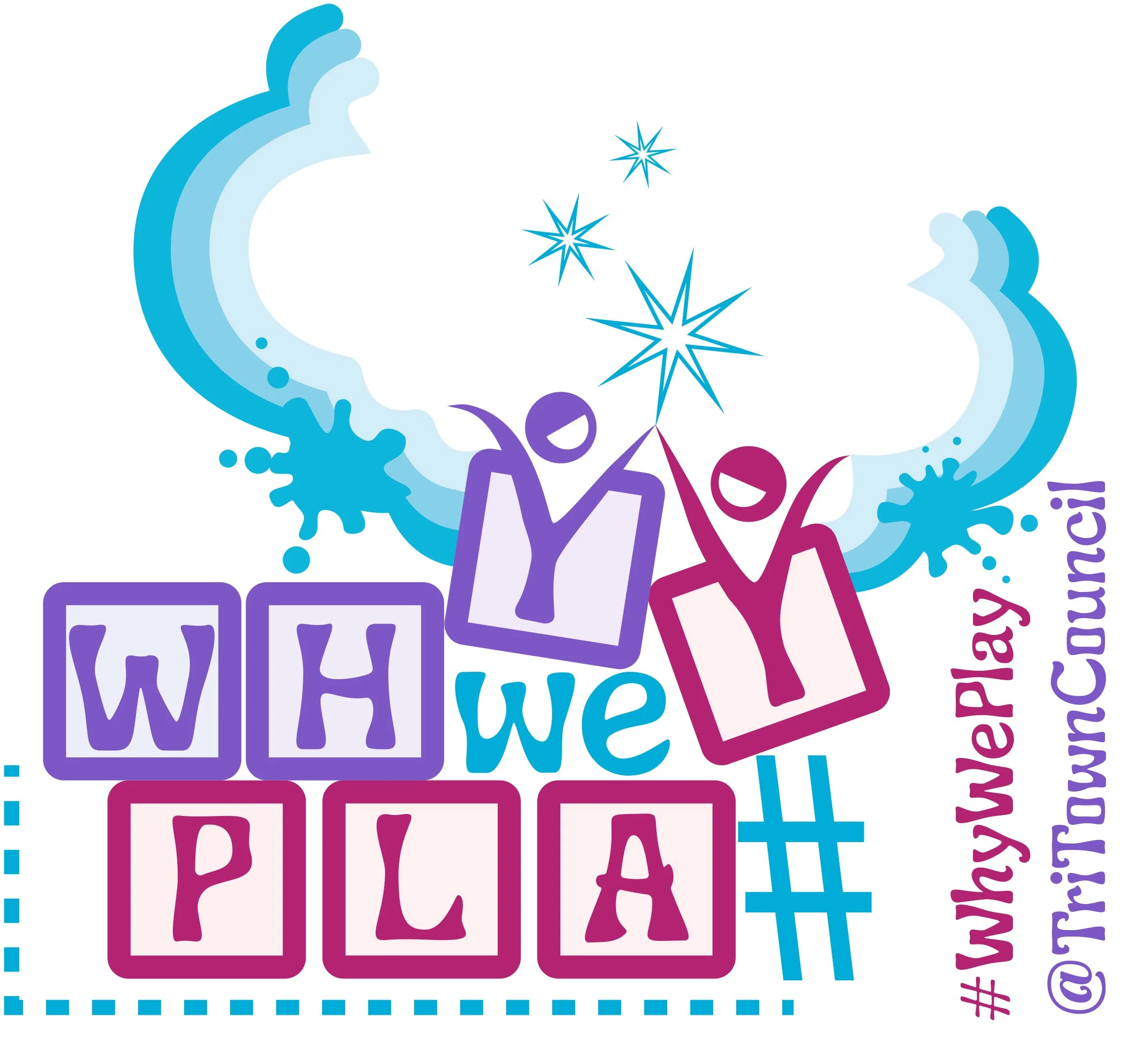
This logo was created for Tri-Town Council’s campaign about the importance of free play for healthy development. The “building blocks” are a metaphor for the foundational learning that happens in play, as well as being one of the first objects that children often play with.
The letter Ys in both WHY and PLAY are expanding beyond the shape of their blocks to represent playful children entering the magical creative and imaginative space of play.
The hashtag that would normally be at the start of the phrase has been moved to become a ladder for the Y in PLAY to reach the other. This represents the way that in true play we use whatever is available—sometimes transforming purpose to meet the needs of the playful spirit. It also represents the physical aspect of play, and the growth that happens when we try new things and climb up beyond what we know we were capable of.
This logo is about the remembering the essential learning that happens through making time for free play.
Boxford PTO Event Logos Design
Our Boxford PTO (Parent Teacher Organization) works hard to create memorable events for our schools and community. Although I didn’t create the original PTO logo, I enjoyed creating this playful series of logos for 12 of our PTO events throughout the year. They are used in the annual event schedule and promotional emails, flyers, posts, etc. — visually connecting all the events to the PTO, while also distinguishing each one with its own unique style and meaning.
Eleven of the logos use the children in variations to connect with the PTO logo, and the logo for the adult Spring Auction uses just the (adult) hand from the original PTO logo. Each logo’s unique identity is created through color, typographic style and playful symbolism about the event.
These logos are about the care and joy that support our young people when parents and schools work together to build positive community and experiences. These simple graphics represent a whole lot of creativity, energy and love.
kidSHINE Logo Design
Local Occupational Therapist Dr. Amy Wheadon opened her dream company: a holistic activity center that helps to empower young people with confidence and skills (physical, cognitive, behavioral, social, etc.) I had the honor of working with Amy to create the logo and identity system she envisioned for kidSHINE. The logo is used in signage, clothing, printed promotional materials, website, and social media.
This logo is about the joy and light that comes from recognizing ones own accomplishments and inner strength.
Boxford One Town One Plan Logo Design + Campaign
Our town of Boxford proposed the concept of caring for our community with a large, long-term plan that involved several different buildings and populations. With a long history of building proposals not being approved by voters in different groups, the idea was that we can all grow by supporting each other and our various interests in our low-commerce town. It was a lovely intent and concept in which I was happy to be involved.
The logo represents the simple concept of different causes working in a cycle together toward growth. My portion of the campaign involved creation of signage, a series of flyer/updates, a website, facebook page, slideshow video, and promotional postcard. Although the plan wasn’t approved as initially presented, this campaign was an important step toward town spirit, care, and motivation for community projects that are in development now.
The logo and campaign are about the value of working together to take care of our community.
design for time Logo Design
This logo really expresses a wish. It is about the potential energy in even the smallest spark of time. It represents those tiny little moments that can mean so much more than their quantified measure. As educators, creatives—humans, really—these are the moments we live for: to feel or comprehend something beyond ourselves and this moment, in this moment. In my art and my design work, I like to play with the concept of time, so this idea felt natural to represent the work I do, and hope to do. The graphic captures an abstract representation of “d” and “t” for “design for time” (as well as d and t of my two last names, Doucette and Thornborough). The “t” is also a tiny compass rose that implies a moment’s existence in space. The “d” is the energy coming out of it: a flickering flame of an inspired passion, a quiet droplet of expressed compassion—or any number of other emotions those elements could represent.
This logo is about my desire to do work, as a teacher and creative, that has a positive impact beyond its time.


